Your Jazzy Dashboard Is Not For Everyone
Colourful charts can turn into frustrating puzzles for humans with colour blindness. Here's how to design for inclusion better.
Colour blindness, also known as colour vision deficiency (CVD), is the decreased ability to see colour or differences in colour. Red-green colour blindness is the most common form, followed by blue-yellow colour blindness and total colour blindness. Red-green colour blindness affects 1 in 12 males (8%) and 1 in 200 females (0.5%). With almost 300 million colour-blind people globally, it's crucial to consider this condition when designing our user interfaces (UI), especially dashboard charts.
When designing charts in dashboards, various colours mark different data representations. It may be tricky or impossible for viewers with CVD to differentiate between elements. Here's where understanding colour blindness and implementing intelligent design solutions come into play.
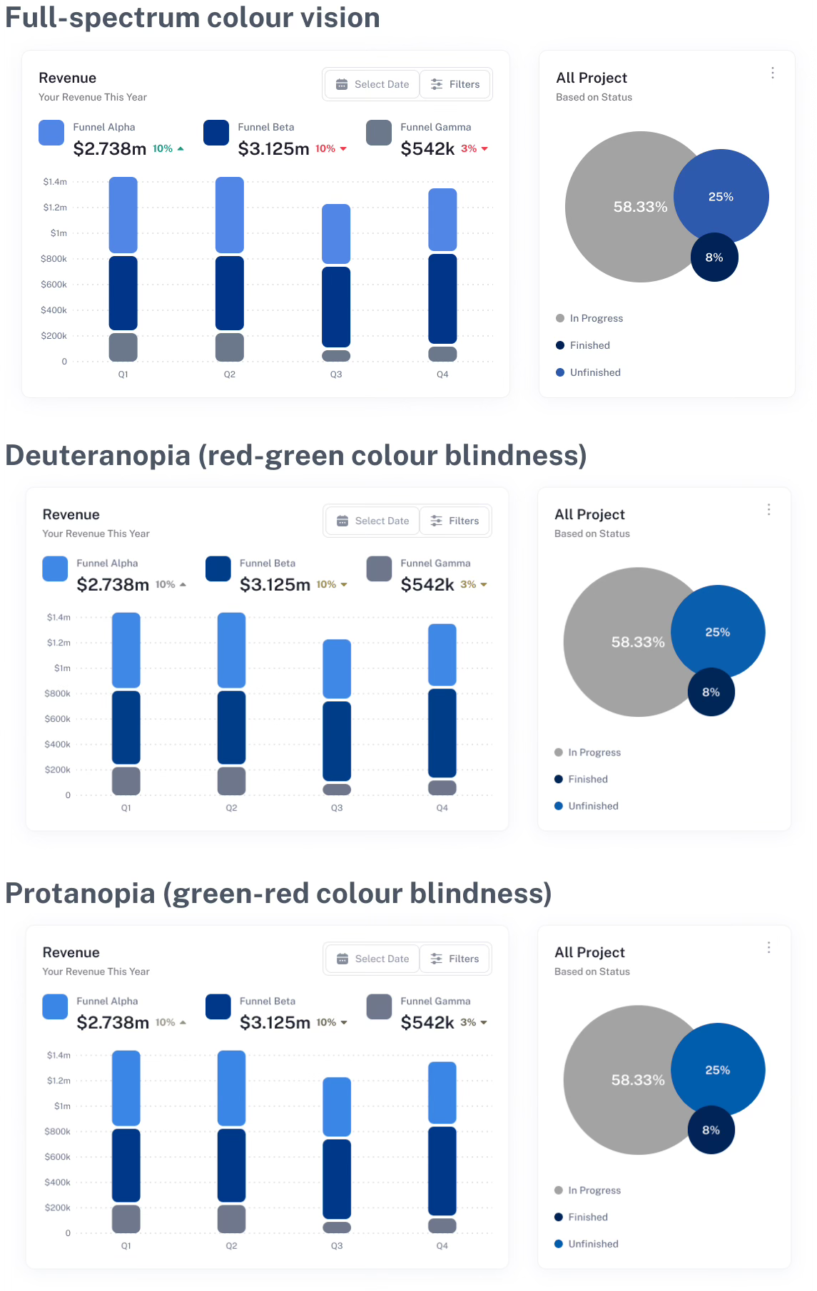
Let's delve into a common pitfall in chart design. Consider charts, with each data series distinguished by a different colour. For people with red-green colour blindness (Protanopia), the chart might look like a mass of indistinguishable bars as similar colours blend together. The same goes for green-red colour blindness (Deuteranopia), where even the most vibrant charts can appear muddled and confusing
How do we fix this?
By working with shades of the same colour instead of multiple hues. Varying the saturation and brightness within the same colour creates distinguishable shades without relying on hue. This approach caters to the ability of colour-blind individuals to perceive changes in luminance, the perceived brightness of colours.
Each data area becomes easily distinguishable, using different shades of the same hue, such as blue, despite the uniform colour. The contrast levels remain, ensuring the data is effectively communicated.
This principle applies to many visual representations of data where colours are used as indicators. The larger the data series, the more beneficial it is to vary shades.
Remember, designing for accessibility doesn't mean limiting creativity. By experimenting with saturation and brightness, it's possible to cater for numerous data series. Adding another hue may be a potential solution if you exceed your shade options.
To wrap this up, it's time we stopped using multi-colour marks in our charts. By designing with shades instead of hues, we ensure our dashboard charts are accessible to all, including our colour-blind users. Let's design for everyone and create an inclusive digital environment where all users can easily interpret data, regardless of their vision.


